Why I Design in Figma and Ship in React (And Why More Designers Should)
I design it. I build it. I ship it. This isn't just a tagline; it's a workflow born from frustration. The traditional handoff between designer and developer is broken. It's a chasm where intent gets lost, details evaporate, and timelines stretch. I've spent years bridging this gap, not by improving communication, but by eliminating the handoff entirely. I design in Figma and ship directly in React. More designers should too.
The Handoff Problem: What Gets Lost
Designers create pixel-perfect mockups in Figma. Developers translate those mockups into code. Sounds simple. It rarely is. What gets lost in translation?
- Spacing and Micro-interactions: A 4px difference in padding might seem minor in Figma. In a live browser, it can make a component feel cramped or unbalanced. Subtle hover states, loading animations, and focus indicators are often overlooked or simplified during handoff, stripping the design of its intended polish.
- Edge Cases and Responsiveness: Figma files often show ideal states. What happens when data is missing? When text overflows? How does the layout adapt to a tablet in portrait mode? These questions are frequently an afterthought, leading to unexpected UI behaviors in production.
- The 'Feel' of the Design: The most critical element lost is the intangible 'feel.' A design isn't just a static image; it's an interactive experience. The rhythm of animations, the snap of a button click, the fluidity of a transition—these are things you can only truly evaluate in a live browser. When one person designs and another builds, this feel is the first casualty.
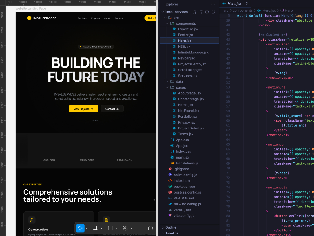
My Workflow: Figma to Browser, Fast
My process is built to close this gap. It's a tight loop between design and code, where the browser is the single source of truth.
-
Figma for Scaffolding: I start in Figma, but not to create a pixel-perfect replica of the final product. I use it for high-level layout, typography exploration, and establishing a design system foundation (colors, spacing, core components). It's a blueprint, not a painting.
-
Build in React/Next.js: I move to code almost immediately. My stack is typically Next.js with Tailwind CSS and shadcn/ui. This allows me to translate design tokens from Figma directly into my Tailwind config. I build the components, not as static elements, but as interactive pieces of the UI.
-
Iterate in the Browser: This is the most crucial step. I spend 90% of my time in the browser, tweaking, testing, and refining. Is the button click satisfying? Does the layout hold up on a 320px screen? Is the form submission flow intuitive? The browser doesn't lie. It's where the design truly comes to life or falls apart.
Real Example: Shotframe
While building my SaaS, Shotframe, I designed a component for users to select different device frames for their screenshots. In Figma, it looked great—a clean, simple grid of options. But in the browser, it felt wrong. The click target was too small on mobile, and the transition between selected states was jarring. Because I was both the designer and the developer, I didn't need to file a ticket or explain the issue. I dove back into the React component, adjusted the padding, tweaked the Framer Motion spring values, and redeployed in minutes. The feedback loop was instantaneous.
Real Example: Montrichard
Working on the Montrichard e-commerce site for Disney products, I was able to design and code new Shopify landing pages myself. This meant I could run A/B tests on a new layout and have results by the end of the day. A traditional workflow would have required design mockups, a handoff meeting, a development sprint, and a QA cycle—a process that could take weeks. My hybrid approach allowed us to iterate at the speed of the market, not the speed of our internal process.
The Speed Advantage
The primary benefit of this workflow is speed. There are no back-and-forth conversations trying to explain why a developer's implementation doesn't match the design. There are no "that's not what I designed" conversations. The design vision is preserved, not interpreted. This direct path from idea to production means faster iteration, quicker launches, and ultimately, a more polished product.
When This Approach Breaks Down
This isn't a universal solution. The designer-who-codes model thrives in specific environments:
- Small to Medium Teams: In very large organizations with hundreds of designers and developers, specialized roles become necessary for coordination and scale. My approach is best suited for seed-to-Series B startups where agility and speed are paramount.
- Complex Backends: While I handle frontend development, my focus is not on intricate backend systems, database architecture, or DevOps. For projects requiring deep backend expertise, collaboration with a dedicated backend engineer is essential.
Conclusion
The gap between design and development is an artificial construct, a relic of a time when tools and skill sets were more siloed. By embracing both design and production-level code, I eliminate that gap. I deliver not just beautiful interfaces, but functional, performant products that ship. This is the future of product development, and it's a future more designers should be building.